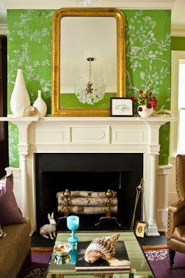
Last week I came across a green colored sofa that I loved. I lean towards neutral sofas as a safe and a stand the test of time purchase as our taste evolves. But for the more adventurous, a sofa with a pop of color is a great option. So instead of going over the top with this design below I chose a sofa with a soft color as the center of the design scheme. Please tell me what you like about the design!
Saturday, December 31, 2011
Friday, December 23, 2011
Beautiful Image for the Day!
Monday, December 19, 2011
Blue, Lavender and White, Great Combination!
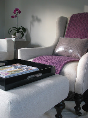
I am working with a client who wants to incorporate soft blues and lavender against a creme sofa and white walls. She had a hard time visualizing the combination but I think these photos capture how great they all look together. This combination is slowly becoming a personal favorite of mine!
Wednesday, December 7, 2011
Wednesday Ramblings....
I have been stuck at home too many days than I would like to think about. I had a surgery and the side effects are sticking around longer than I thought they would. So, I have been catching up on lots of rest. Which brings me to my ramblings today. I have been thinking about this a lot and I feel like it is time to put it out there to you. Recently, I have been in contact with several interior designers. Many of these designers are older women in their fifties, who have an established business. Look at these images below that some NJ designers posted on their website, case in point.
These designs are well thought out but I often find that their take on design ideas are very "in the box." What I mean is that they tend to be on the safe, traditional style of design that doesn't seem to fit the young modern families in our area. Golden yellow colored walls, plum color damask fabrics, cherry cabinetry and that famous camel colored granite, etc. I was in an interior shop in Princeton, NJ and overheard a conversation of a woman who was desiring to modernize her home because she feels like when you walk in, it feels more like her mothers home instead hers. Her mom was right next to her agreeing. This exemplifies the challenge. Most of the homes in the northeast have architectural elements of a colonial design and I think that designers get stuck. Colonial design is one of my favorites but you can easily update a colonial with flooring, colors and furnishings and make it hip, modern and fun. I have walked into too many homes of young families that feel like an older couple in their 60's live there instead of family in the late twenties. One factor that contributes to this is that we often start out with passed down furniture pieces from grandma and others. So, I guess what my purpose in writing this today is to encourage doing research when choosing an interior designer. Their portfolio tells a lot about their take on design as does their appearance. Our home should be a reflection of who we are as individuals and families. Designers that push us out of our comfort zone with fresh ideas are worth considering. I would love to hear your thoughts on this subject, please leave me your comments!!!
These designs are well thought out but I often find that their take on design ideas are very "in the box." What I mean is that they tend to be on the safe, traditional style of design that doesn't seem to fit the young modern families in our area. Golden yellow colored walls, plum color damask fabrics, cherry cabinetry and that famous camel colored granite, etc. I was in an interior shop in Princeton, NJ and overheard a conversation of a woman who was desiring to modernize her home because she feels like when you walk in, it feels more like her mothers home instead hers. Her mom was right next to her agreeing. This exemplifies the challenge. Most of the homes in the northeast have architectural elements of a colonial design and I think that designers get stuck. Colonial design is one of my favorites but you can easily update a colonial with flooring, colors and furnishings and make it hip, modern and fun. I have walked into too many homes of young families that feel like an older couple in their 60's live there instead of family in the late twenties. One factor that contributes to this is that we often start out with passed down furniture pieces from grandma and others. So, I guess what my purpose in writing this today is to encourage doing research when choosing an interior designer. Their portfolio tells a lot about their take on design as does their appearance. Our home should be a reflection of who we are as individuals and families. Designers that push us out of our comfort zone with fresh ideas are worth considering. I would love to hear your thoughts on this subject, please leave me your comments!!!
Monday, December 5, 2011
Office Area Rug?
I am so torn about what area rug to put in my office.
The desk and chest are black against navy walls and I want something that is fun and vibrant. There is a part of me that would like a geometric style like these below......
The desk and chest are black against navy walls and I want something that is fun and vibrant. There is a part of me that would like a geometric style like these below......
Then there is this other part of me that wants something even more dramatic like these.....
Do you have a preference?
Sunday, December 4, 2011
Our Home Update!
I just wanted to share some photos of the little bit of progress we are making with our home. Just to refresh your memory, we recently moved back into our house after living abroad for a year. We have done mostly painting but we have also bought some new furnishings and accents. Below is a shot of my home office in Ben Moore's Hale Navy. Other photos show some furniture for our living room and a gallery wall I am working on going up the stairs. Finally, a sneak peek of our bedroom which will be last room to be finished up!
We started with this room and painted it BM Hale Navy and replaced the carpet with hardwood floors.
This photos shows one wall in the office where my cork memo board hangs. I just bought a piece of cork board, spray adhesive glue and a wonderful black weaved fabric. I am really happy with how it came considering I don't feel like I am a professional DIYer....
I shared this photo already but we added this great LEE Industries chair and ottoman and one more chair will be ordered shortly to complete the room.
This is the staircase that leads to our office loft. I found this great Hudson Valley's Garden City Aged Brass Wall Sconce online and I am now slowly putting together a gallery wall going up the stairs.
And finally a sneak peek of our restful and calm bedroom. The lamp I snatched for a mere $10 at a flea market in the Hudson Valley. It was bright orange so a little bit of white paint, gold spray paint and a shade I already had and it all came together! I have another matching lamp but I am not sure where I will put that one yet!
Saturday, December 3, 2011
Green Goodness!
These images below highlight the color green in just the right amount. Here are some interesting facts below about the color green.
Green occupies more space in the spectrum visible to the human eye than most colors, and is second only to blue as a favorite color. Green is the pervasive color in the natural world, making it an ideal backdrop in interior design because we are so used to seeing it everywhere.
 |
| Images via Decor Pad, Pink Wallpaper and Veranda Enjoy another beautiful weekend! |
Subscribe to:
Posts (Atom)


