I am so excited to bring to you my two latest e-designs for a local New Jersey photographer Stephanie Sherwood! She contacted me a few weeks ago to create a design for the amazing space she has. She is so talented and has a great eye, this combination made me a little nervous because I really wanted to make sure I was giving her something she loved! Here is a part of her email:
"The vibe I am trying to achieve is an "anthropologie" antique, eclectic, happy, sunny, chic, warm, sophisticated kind of thing. I like artsy sophisticated."
I have given it a lot of thought.......My initial plan was a dark, moody room that would be used as a backdrop for her amazing photographs. But sunny, warm and happy just didn't seem to fit in with that scheme!?!?!
So again, I decided to do two designs and give her the option to choose which one she like better. That means you too! So, please vote for your favorite design in your comments! I always enjoy reading them and look for constructive suggestions too! So be open and share!
Let's begin with the the photos of her great office!


Don't you just love this room! The amount of windows is wonderful, the french doors fabulous and the woodwork is really nice too!
What first came to mind was to create two separate areas in the room using placement of furniture. The room is a more of a rectangle shape and has plenty of space to do that. She already has the concept implemented with her great antiques! So let's get started to design number one!
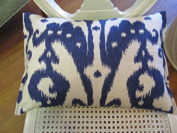
Option Navy
Here are the two design inspiration photos that drew me!


You probably guessed it! Dark navy, white and gold accents are the colors and finishes I wanted to use in this space. Why? Well, one of my biggest concerns was making sure her photographs become the focal point in the room, the dark navy wall would make the pictures just pop! Similar to the photo above. I also wanted to keep it fresh and youthful and not too "grandma-ish" with antique overload either. So the choices of color, furniture and accents in the design below are a really great combination!
Let's begin........
Color Ralph Lauren Club Navy for the walls including the chair rail is really good. You can also paint the baseboard and crown molding the same color with high gloss for visual impact and keep the molding around the doors and windows white. It is really up to you!


Add drapes in this amazing fabric by Drape Palace to really bring drama into the room. The room has enough natural light to do it!
The first seating area I will highlight would be in front of the french doors. I wanted to create this seating space using this beautiful rug from Anthropologie. It combines black, navy and teal and I just fell in love with it!

Placed in front of the window to the right when you first walk in, this vintage inspired settee from Horchow. My favorite piece of this design!
Horchow runs furniture sales with 25% off, this settee is not a bad price for $750!

Throw a couple of these silk pillows on from Etsy.........

place two of these great tables from Clayton Gray side by side in front of the settee and display your favorite magazines......

The wall you look straight at when you walk into the room would make a great gallery wall! To keep the space open use this great console table from Brocade Home to display some of your favorite decor pieces.
Nothing too high to block the view of the upper part of the wall.

A floor lamp in the corner between the settee and console table would add a nice touch. This black and gold one is perfect!

The great vintage mirror Stephanie already has can be used anywhere in this room and work with this scheme!
Now for the seating area which includes that great desk, which she is keeping. Love it! The desk is in a great position already but I think having two chairs in front of her desk to meet with clients would really be practical. These chairs from Ballard Design would be just perfect!

each chair having its own small pillow and this little end table in between is just the right fit!

I would love to see a great lamp on the right side of the desk. Something substantial...... the computer screen can moved to the side at an angle when a meeting is in progress so you can speak directly to the client without the screen in the way. Just a thought. OK back to the lamp, I am loving this one from Worlds Away!

add some awesome vintage photographs with matting and gold frames on the wall behind the desk

If the color scheme is lacking something in your eyes add these fantastic ORANGE accents. Yes, orange would complement the navy perfectly!!


Completed Option Navy!
Option Turquoise!
Inspirational photos to share!
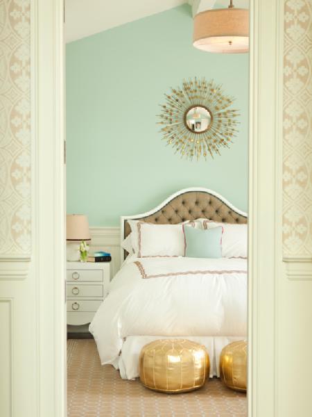

Taupe, gray, turquoise and gold are the colors that I wanted to bring together for a warm, sunny and vintage vibe that this design has! Stephanie lives near the ocean, so incorporating just a touch of a beachy vibe was also on my priority list. So here it goes!
Sherwin Williams Versatile Gray is a great choice for the walls and against the white trim.

These cotton/linen blend curtains from Half Price Drapes, stunning!

To ground the entire room, use one natural jute/wool rug like this one from Home Depot. You should be able to find remnants or even carpet off the roll and have it bound to the exact size you need.

In the seating area near the french doors use the same placement as above. This great settee from Ballard Design is irresistible!

add one throw pillow like this larger one from Michele Varian.....

and on the floor right in front of the settee, place these two sweet gold poofs from Nate Berkus

along the gallery wall, this gold leaf and reclaimed wood console table from Clayton Gray brings another natural element into the room

and into the corner this cute, funky modern floor lamp from Clayton Gray again!!

Now for the opposite end of the room. The same placement of furniture used in the above design using this pieces instead. Two chairs like this one from Ballard Design with the same smaller pillows as above!

hang this chic and cheap chandelier from World Market above the desk for a little shimmer

place this sweet vintage lamp with a drum shade from Etsy on the desk

and for my favorite piece of the this design, this coveted storage cabinet from Horchow placed right under the wall mounted TV

add a vintage camera photo from Etsy and a mirror from Wisteria like to the walls and this design is complete!!!!!!!!!!!!!!!!


I hope these designs have given you some ideas that may work for your own home!
Thanks for reading! Have a great weekend and I look forward to reading your comments. Don't forget to vote!
Denise!
ReplyDeleteI love your designs and the attention to details are incredible. Love the world market chandelier, it would be stunning! The colors are both awesome and I think...the navy blue with orange accents is bold and sassy and it would stop a person in their tracks.
Thanks for the compliments! Just a tip, if you purchase the same smaller chandelier and place it inside the larger one when you mount it to the ceiling, it even looks better! Not too shabby for under $100!
ReplyDeleteI love the navy option. Dark colors with pops of white, gold and orange are great! Love the settee!
ReplyDeleteI think the navy option has great drama.
ReplyDeleteThe room has enough natural light to handle a strong color. The lamps are exquisite, in both
options. You have amazing vision.
Okay, I think I am going to break away from the crowd here and say I like the turquoise/grey option better! The navy is dramatic, but may not be as "sunny, happy, or warm" as the homeowner wants. I really like the lighter colors for the beach...and to keep the room light and airy. And the World Market Chandelier is great. Good job pulling these ideas together!
ReplyDeleteI like the lighter option as well, I think it would be wonderful to work in that office!
ReplyDeleteLOVE both your ideas, but lean towards the navy having been in the space personally. Great choices in the unique accessories.
ReplyDeleteFinally had a chance to sit down and really go through your ideas. My first opinion is i love the dramatics of the first design I love the blue, i love the gold i love the white mixtures. dramatics, i love it. Prior to how I had the look of the room now i had black walls(upper half was black- btw the bottom half of the chair rail is more a cream than white) and that was super dramatic made the photos pop and everyone loved it. I got so many compliments on it and it really did look amazing. But i decided i needed something lighter and airier to work in, which is what i have now. So my instinct is to go with the dramatic look, but I don't know if in a year or two I would want to go back to something more open and airy. Since I have had the two different spectrums to work in I am able to compare these two designs fairly well as to how it is working in it. And it is different working in rooms that are dark as apposed to rooms that are light. It's so hard too because I can not really picture the second style you worked on, where as I immediately saw and pictured this room in the first design. Another element that i have to keep in mind is how it looks from the front room. Since these are glass doors you see this room from the other room. the room that leads into my office is a more rustic kind of room, with ralph lauren's river rock on my walls(kind of an army rustic green), with a really awesome custom built distressed mantle and fireplace my dad built. it has a very distinct style and color theme, as well as the dining room that is dark red right off of it. so with this in mind it makes me lean more towards the muted colors of the second design. but still my love of dramatics says go for the blue go for the blue.
ReplyDeleteI totaled up what the first design would relatively cost me and that was about 10 grand.- which is a lot for this one room. The lighter design would be easier to incorporate and cost less.
O and i forgot to mention I typically meet with my clients in the seeting area. it is very rare that I would sit with them at my desk unless we are doing real time album changes. So some more seating would be needed in that end of the room.
ReplyDeleteHi Stephanie,
ReplyDeleteI came up with some ideas for extra seating the area of the office that you would meet with clients. I will email them to you. Thanks for all your feedback! I am excited to see what direction you take:)
I am a huge fan of the navy & orange. They are dramatic and bold. I too like the world market chandelier.
ReplyDeleteI loved the turquoise design scheme and think that the extra seating you brought in with the chase would create a cozy setting to meet with clients. The vintage camera was a great find and it would b a focal point in the space.
ReplyDeleteOooh, I'm torn. Both are gorgeous! If it was me, I thinbk I'd plump for the lighter option. NOt for the light/dark but because I think I prefer the colour. I love your attention to detail.
ReplyDeleteAnd the furniture you chose, particularly for the second option is GORGEOUS!
Sarahx
Hi,
ReplyDeleteI am joining Sarah's lovely party from my vintage apartment in Chicago. So glad you joined, too.
Fondly,
Glenda
Gg - Notes on the Journey
Link #26
ps. Your blog is full of so many creative pieces.
I know this is an older post, but in case you are still viewing votes... I am entranced by the navy room, but I would go with the turquoise room- I love it.
ReplyDeleteYup! Super like on your choices! They are quite elegant! But, the navy option is the stunner among all of them! :)
ReplyDeletePositive site, where did u come up with the information on this posting?I have read a few of the articles on your website now, and I really like your style. Thanks a million and please keep up the effective work.
ReplyDeleteCrystal Chandeliers Sale
I read a article under the same title some time ago, but this articles quality is much, much better. How you do this..
ReplyDeleteCrystal Chandeliers Sale
Thanks for your insight for your fantastic posting. I’m glad I have taken the time to see this. ui/ux
ReplyDelete